Phone chargers live in that strange category of tech we use constantly—but rarely think about.
They’re not exciting. They don’t get product launches or headlines. But they are one of the few accessories that can directly impact the health, safety, and lifespan of your phone.
And yet—most people treat them like an afterthought.
Why Choosing the Right Phone Charger Matters
There’s a common assumption that all chargers are the same.
They’re not.
Low-quality charging blocks—especially cheap, unbranded ones—often lack proper power regulation and heat protection. That can lead to:
Slower charging speeds
Overheating
Reduced battery lifespan
Potential long-term damage to your device
When you’re charging a premium device like an iPhone, using a reliable charger isn’t optional—it’s essential.
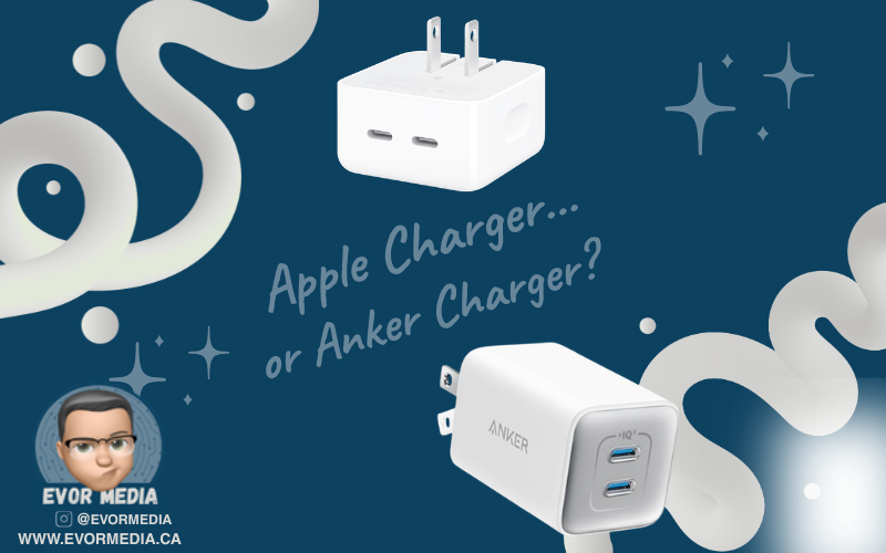
Best Phone Charger Brands: Apple vs Anker
After narrowing things down, there are really only two brands worth considering:
Apple
Anker
Both offer high-quality, safe, and reliable charging—but they approach it differently.
Apple Chargers: Reliable and Built to Last
If you want complete peace of mind, Apple is the safest choice.
Apple chargers are designed specifically for their devices, ensuring compatibility and long-term reliability. Their standard 20W USB-C charger delivers consistent performance and is ideal for everyday use.
That said, it’s not perfect.
The design is bulky
It takes up extra space on power bars
It only offers a single port
But durability is where Apple stands out.
Many people still use older 5W Apple charging bricks today—even ones that shipped with early iPhones—and they still work. They may be slow by modern standards, but they remain dependable.
Anker Chargers: Best Value and Convenience
If Apple is the safe choice, Anker is the practical upgrade.
Anker has built a reputation for delivering high-performance chargers with better design and more features.
With Anker, you get:
Compact chargers that don’t block other outlets
Multi-port charging for multiple devices
Faster charging speeds
Better overall value
For most people, Anker offers the best balance between price, performance, and convenience.
Apple vs Anker: Which Charger Should You Buy?
It comes down to what you prioritize:
Choose Apple if you want maximum reliability and zero risk
Choose Anker if you want better design, more features, and strong value
Either option is far better than using a cheap, unverified charger.
Final Thoughts: Stop Treating Chargers Like an Afterthought
Your phone charger is something you use every day—often for hours at a time.
It powers your device overnight. It travels with you. It quietly supports everything you do.
The best charger isn’t the one you think about—it’s the one you never have to.
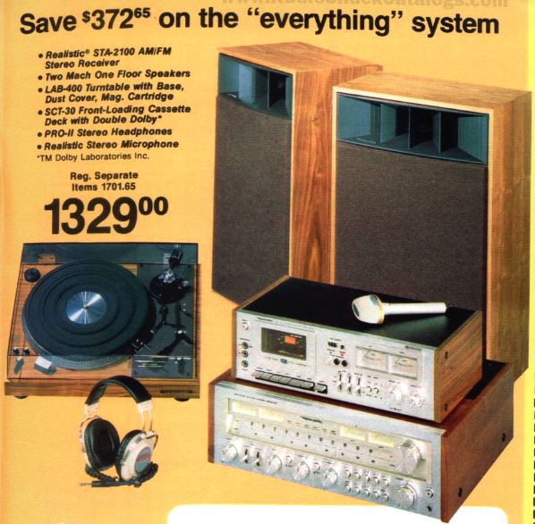
The system included Radio Shack house brand Realistic components:
STA-2100 AM/FM Stereo Receiver
Two Mach One Floor Speakers
LAB-400 Turntable with base, dust cover, magnetic cartridge needle
SCT-30 front-loading cassette deck with Double Dolby
PRO-II stereo headphones
• ⁃ Stereo microphone
Back in 1979, Radio Shack had a pretty good stereo system that went for $1,329—which, if we were to adjust for inflation, would be about $5,700 in 2026. This system had a cassette tape player, which was still pretty new since that medium really started to take off in the mid-1980s. It was late 1970s tech, but to put it in perspective, for $5,700, it was just a music player.
I enjoy looking at how things have changed over the years, and it can be a fun way to see how far we’ve come. That stereo system, which would cost over $5,700 in 2026, is more than I’d pay for a 65-inch TV with a soundbar and subwoofer, which would totally outshine the 1979 system. Another comparison is that I can get an iPhone 17e for $900 CAD and a 200-watt Bluetooth party speaker from Amazon for $150 CAD, all for just over $1,000 CAD. On a side note, with that new iPhone, I’d get three months of free access to Apple Music, which means I could listen to pretty much every song ever recorded. So, yeah, life in the 1970s was pretty pricey.
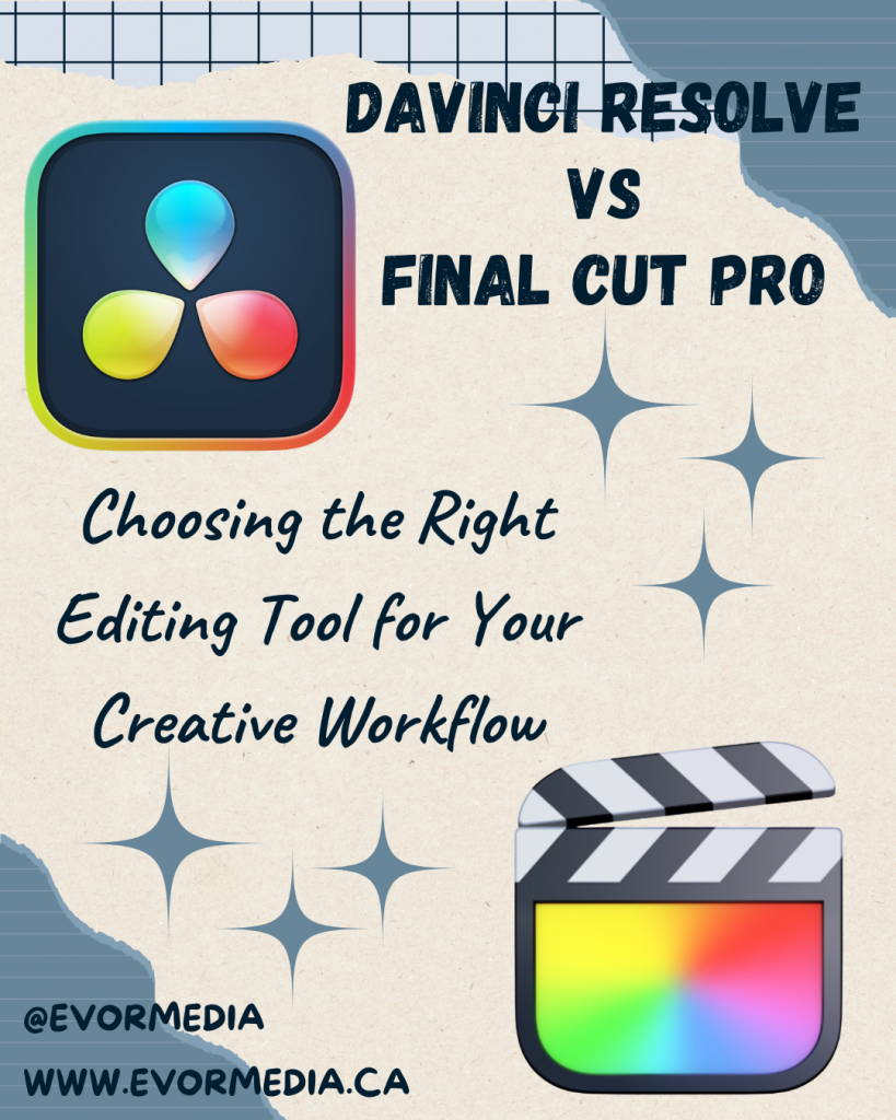
Choosing the Right Editing Tool for Your Creative Workflow
Not long ago, professional video editing required a studio, a team of specialists, and software that cost thousands of dollars. Today, anyone with a laptop and an idea can produce work that rivals traditional media. The tools have become incredibly powerful—and surprisingly accessible.
Two programs sit near the top of that modern editing landscape: DaVinci Resolve and Final Cut Pro.
Both are professional-grade video editors. Both are capable of producing feature films, documentaries, YouTube channels, and everything in between. Yet despite their similarities, they represent two very different philosophies about how video editing should work.
One prioritizes an all-in-one professional production environment. The other prioritizes speed, simplicity, and a deeply integrated workflow on the Mac.
The interesting question isn’t which one is better. The interesting question is which one fits the way you like to work.
Because in creative tools, workflow matters far more than raw capability.
Two Very Different Origins
To understand the differences between DaVinci Resolve and Final Cut Pro, it helps to understand where each one came from.
DaVinci Resolve began life as something very specific: a high-end color grading system used in Hollywood post-production studios. Long before it became a full editing platform, Resolve was the place films went to get their final visual polish.
When Blackmagic Design acquired the software in 2009, they began transforming it into something much larger. Over time, editing features were added, followed by visual effects tools, advanced audio production, and collaborative features.
Today, Resolve is not just an editor—it’s an entire post-production environment.
Final Cut Pro, on the other hand, grew out of a very different philosophy. Apple built it to make professional editing faster and more accessible, especially for independent creators and smaller production teams.
Over the years, Apple leaned heavily into performance and simplicity. When Apple rebuilt the software with Final Cut Pro X in 2011, it introduced one of the most controversial and innovative features in modern editing: the magnetic timeline.
Some editors hated it immediately. Others discovered it dramatically sped up their editing process.
More than a decade later, Final Cut Pro remains one of the fastest editing environments available—particularly on Apple hardware.
The Philosophy of DaVinci Resolve
Using DaVinci Resolve often feels like stepping into a full film production studio.
The interface is divided into “pages,” each dedicated to a different stage of production. There’s a media page for organizing footage, an edit page for traditional timeline editing, a color page for grading, a Fusion page for visual effects, and a Fairlight page for audio post-production.
At first glance, it can feel overwhelming. There are buttons everywhere. Panels inside panels. Nodes and scopes and advanced tools that look like they belong in a professional color suite.
But once you understand what Resolve is trying to do, the design makes sense.
Resolve isn’t just trying to help you cut video clips together. It’s trying to replace an entire post-production pipeline.
In traditional film production, editing, color grading, visual effects, and audio mixing often happen in separate programs—or even separate studios. Resolve brings all of those processes into a single application.
That integration is powerful.
An editor can move from cutting footage directly into color grading without exporting the project. Visual effects can be built using Fusion without leaving the timeline. Audio can be mixed in Fairlight using tools that rival dedicated audio software.
In short, Resolve is designed for deep, complex productions.
And remarkably, a huge portion of it is available for free.
The free version of Resolve is arguably the most powerful free creative software available today. It includes professional editing tools, advanced color grading, and robust export options. For many creators, it’s more than enough.
The paid Studio version adds features like advanced noise reduction, HDR grading tools, and GPU acceleration. But even without those additions, the free version can handle an enormous amount of work.
The downside to all this power is complexity.
Resolve has a steep learning curve. Beginners often feel like they’ve stepped into the cockpit of a commercial airplane when they first launch it.
It also demands strong hardware. Resolve leans heavily on the GPU, and while it runs on modest machines, it truly shines on powerful systems.
For filmmakers, colorists, and editors who enjoy deep control over every aspect of their project, Resolve is extraordinary.
For someone who just wants to cut together a quick video, it can feel like overkill.
The Cost Question
Another interesting difference between the two platforms is pricing.
DaVinci Resolve offers one of the most generous free versions in the software industry. The majority of the program’s capabilities are available without paying anything.
The Studio version is a one-time purchase, and once you own it, upgrades have historically been free.
Final Cut Pro follows a similar philosophy but without the free tier.
Apple sells it as a one-time purchase through the Mac App Store. There are no subscriptions, and updates are included.
In an era where creative software increasingly relies on monthly subscriptions, both approaches feel refreshingly old-school.
You buy the tool once and use it for years.
Performance and Hardware
Performance is where the two programs diverge in interesting ways.
Resolve relies heavily on GPU power, especially for color grading and visual effects. On a powerful workstation, this allows for incredible real-time performance.
But on weaker systems, playback can struggle.
Final Cut Pro, by contrast, feels incredibly smooth on Apple hardware. Apple has spent years optimizing the software specifically for Macs, and the results are noticeable.
Even large video files often play back without hiccups.
For creators working exclusively on a Mac—especially a modern MacBook or Mac Studio—Final Cut often feels faster.
Resolve can match that performance, but it typically requires stronger hardware.
Which One Should You Choose?
So which program is better?
The honest answer is that both are exceptional.
But they serve slightly different kinds of creators.
If you’re interested in filmmaking, advanced color grading, visual effects, or collaborative production environments, DaVinci Resolve is incredibly compelling. It’s an entire post-production studio inside one application.
If you’re a Mac user who values speed, simplicity, and a streamlined editing process, Final Cut Pro is hard to beat. It excels at getting ideas from your head onto the screen quickly.
For many creators, the decision ultimately comes down to workflow preference.
Some people love Resolve’s depth and structure.
Others fall in love with the speed of Final Cut’s magnetic timeline.
And interestingly, many editors end up learning both.
The Real Secret: The Tool Matters Less Than the Story
There’s a tendency in creative communities to obsess over tools. Editors debate software the way photographers debate cameras or writers debate keyboards.
But the truth is that great storytelling rarely depends on the tool.
You can cut a compelling documentary in Resolve or Final Cut. You can produce a great YouTube channel in either program. Entire feature films have been created with both.
The software simply shapes how you get there.
The best editing tool is the one that disappears while you’re working—the one that lets you focus on pacing, emotion, and narrative rather than menus and settings.
In that sense, the real decision isn’t about features.
It’s about which tool helps you stay in the creative flow.
Because when the software gets out of the way, the story finally has room to shine.
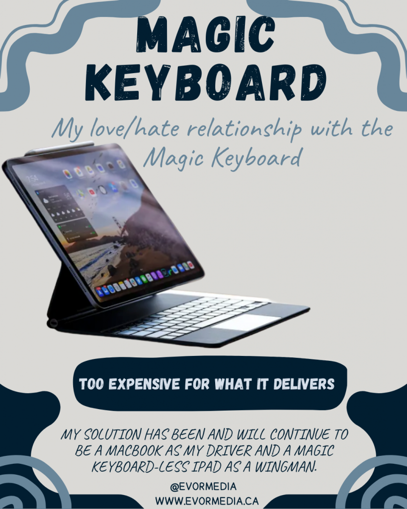
I was at my local Best Buy and saw a stunning 13” iPad Pro on display, all set up with the equally beautiful Magic Keyboard. I’ve had a complicated relationship with the Magic Keyboard since it came out in 2015. On the plus side, it turns an iPad into a MacBook-like experience with magnets that work so smoothly. Plus, it’s versatile enough to be used comfortably in almost any situation. But, the downside is the price. It’s not just expensive; it’s uncomfortably so. The Magic Keyboard is an accessory for the iPad, but it has a price tag that feels like it should be included with the iPad itself. You could even buy an iPad (the basic model) for the price of this accessory!
The Magic Keyboard is pretty appealing, and I can’t help but look at it from every angle. The main thing that stands out is the price, which is absolutely, mind-blowing, ridiculously, obscenely expensive. When you buy an iPad, it should be a rule that you have to get an Apple Pencil with it, or maybe, just maybe, the price should include one. If you buy the iPad and the pencil, adding a Magic Keyboard really pushes the price into MacBook territory.
The iPad with the Magic Keyboard combines simplicity and complexity. On one hand, you have a single device that can be a tablet one minute and a MacBook-like device the next. The complexity comes from needing an accessory for your iPad to make this work, and that accessory adds a lot to the cost of your setup to make it MacBook-like, even though it’s not a full MacBook.
When I look closer, the 11-inch iPad with a Magic Keyboard might offer something different from a MacBook. In terms of size and weight, the 13-inch MacBook Air and the 13-inch iPad with Magic Keyboard are pretty similar, so I’m not sure the iPad setup is better in this case. However, the 11-inch iPad with Magic Keyboard is unique because it’s smaller and lighter than any MacBook, even though it’s still pricey. The combined price of the 11-inch iPad Air with the Magic Keyboard makes it a bit more affordable.
For this to make sense, you need a good reason to want the iPad. The most obvious reason is that there’s an app only available on the iPad. Another reason might be that you prefer the touch or Apple Pencil interface for certain apps. If either of these is true, you might even justify the 13-inch iPad setup.
I’ve considered a possible compromise: I’ll get a MacMini for my heavy tasks, since my current MacBook spends a lot of time docked to a monitor and keyboard on my desk.
One last thing about the Magic Keyboard is that it doesn’t fit all iPad models. This means that future iPad upgrades will likely require future Magic Keyboard upgrades. So, you might end up paying the same high price for the Magic Keyboard again.
My current setup is a MacBook as my main device and a Magic Keyboard-less iPad as a backup. What do you think about the Magic Keyboard, and do you think the features and functions are worth the price?
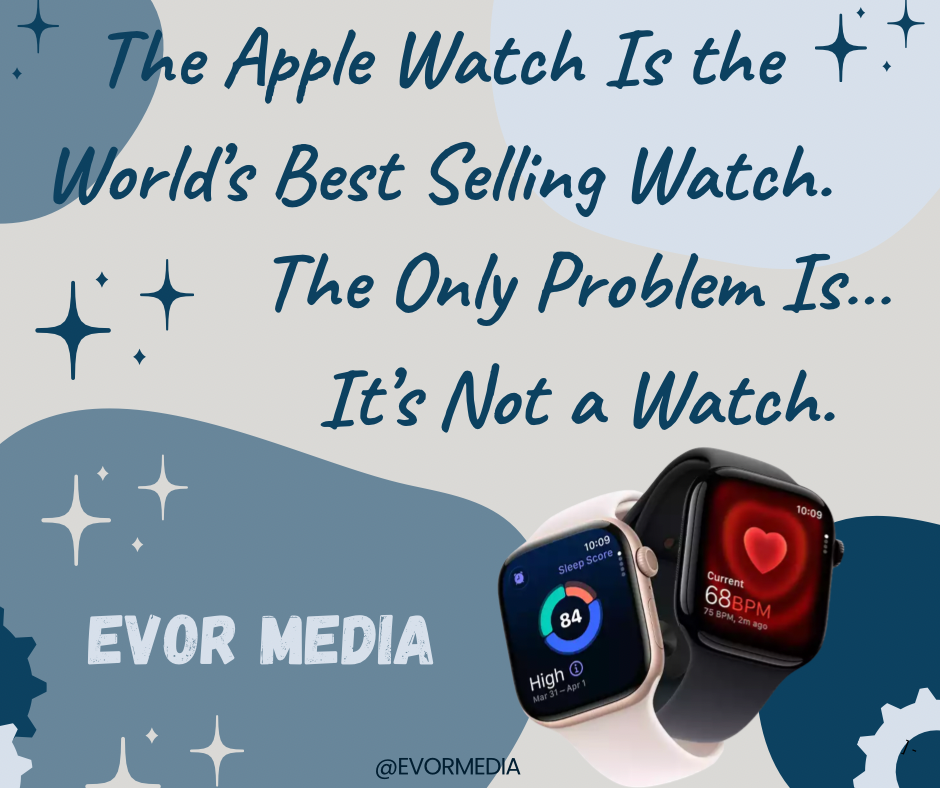
Apple now sells more watches than anyone else on Earth. More than Rolex. More than Omega. More than Swatch. Combined. Safe to say the Apple Watch filled a technological need, but that need was not time keeping.
This is usually presented as a triumph—another industry quietly conquered by Cupertino. A clean headline. A tidy chart. A victory lap for a company that seems to collect entire markets the way others collect loyalty points. And yet, sitting with that fact for more than a moment produces a strange sense of unease. Because while Apple may sell the most watches in the world, almost no one buys an Apple Watch because they want a watch…they buy it because it buzzes.
For most of human history, a watch did one job, and did it well. It told time. Later, it told a bit more than that—who you were, what you valued, where you fit. A watch was a tool, then a piece of jewelry, then a quiet declaration of taste. It was something you maintained, not something you replaced. Something you wound, repaired, passed down. Even the humble quartz watch aspired to permanence. You didn’t update a watch. You lived with it.
The Apple Watch, by contrast, arrives preloaded with the assumption that it will be temporary.
When Apple first introduced it in 2015, the company seemed unsure of what it had made. The launch leaned heavily into fashion. There were glossy magazine spreads. Multiple bands. Even a solid gold “Edition” model that cost as much as a small car. Apple appeared to believe it was entering the luxury watch market head-on, as if centuries of horological tradition were simply another industry awaiting disruption.
That phase didn’t last long.
Within a few product cycles, the illusion slipped. The gold models vanished. The fashion talk quieted. The Apple Watch stopped pretending to compete with Swiss watchmakers and instead became what it always was: a small computer strapped to your wrist, trying to justify its existence between heartbeats.
Today, the Apple Watch is many things, but it is not—at least not primarily—a timekeeping device. It is a notification mirror, a fitness conscience, a health monitor, an iPhone accessory that whispers instead of rings. The time is almost incidental. You don’t look at an Apple Watch because you’re curious what hour it is. You look because something happened.
A message arrived. A ring needs closing. Your heart did something interesting.
This is where Apple succeeded in a way no one else quite has. Fitness trackers had existed for years before the Apple Watch. Smartwatches too. But they often felt like gadgets searching for a lifestyle. Apple reversed the strategy. It took something people already wore and smuggled in an entirely different category of product.
The Apple Watch isn’t really a watch. It’s a health device that happens to tell time.
This distinction matters, because it explains both its dominance and its discomfort. The most compelling features of the Apple Watch are not glamorous. They are quietly profound. Heart-rate alerts. ECG readings. Fall detection. Crash detection. Stories of lives saved not by heroics, but by sensors noticing something wasn’t quite right. This is not horology. This is preventative medicine, disguised as an accessory.
And yet, calling it a health monitor wouldn’t have worked. Few people would voluntarily strap a medical device to their wrist all day, every day. Calling
it a watch made it acceptable. Familiar. Harmless. Almost traditional.
Traditional watchmakers, for their part, were never really in danger. Apple didn’t steal their customers; it simply created a parallel universe. A Rolex is not obsolete because an Apple Watch exists. They solve entirely different emotional problems. One aspires to timelessness. The other assumes replacement. One grows more meaningful with age.
This is a test
The other politely suggests an upgrade every few years.
This is perhaps the strangest tension at the heart of Apple’s success: the Apple Watch is something you wear like jewelry but treat like an appliance. It lives on your body, yet ages like a phone. Scratches don’t tell stories; they signal trade-in value. A dead battery isn’t repaired—it’s retired.
So what, then, should we call this thing?
A wrist computer feels too technical. A health tracker feels too clinical. An iPhone accessory feels dismissive. “Watch” remains the least wrong word available, even if it stretches the definition beyond recognition.
And maybe that’s the real achievement. Apple didn’t just make the world’s best-selling watch. It quietly redefined what a watch is allowed to be. Not a keeper of time, but a keeper of attention. Not a symbol of permanence, but a companion to the present moment. Something less about hours and minutes, and more about nudges, rings, and gentle reminders that your body is, at this very second, doing something worth measuring.
The Apple Watch wins not by honouring the past of watches, but by moving beyond it entirely. It succeeds by wearing a familiar name like a disguise—just enough tradition to feel comfortable, just enough technology to feel inevitable.
And that may be Apple’s greatest trick of all: building the world’s most successful watch by making something that, deep down, doesn’t really want to be one.
I love reading both fiction and non-fiction books, and ideally, I’d be diving into one of each at the same time, well not the exact same time, but you get the idea. I’ve got one of each on the go all the time.
I’m a big fan of fiction through audiobooks. It’s like having a movie in my ears, and I wouldn’t trade that experience for anything. This post is all about my approach to reading non-fiction books, since it’s a bit more involved than fiction. Mostly, I’m trying to get more than just entertainment out of them.
You might have noticed I’m using the word “consume” a bit loosely, like I’m eating books, but I don’t want to offend any of the purists out there who might call me out for claiming to have read an audiobook. And while audiobooks are listened to and books are read, both are consumed in our minds.
When I first learned to read as a kid, it was super easy. Books were just books, and you could buy or borrow them from the library. I know audiobooks existed back in the ‘80s, but they were pretty rare and expensive.
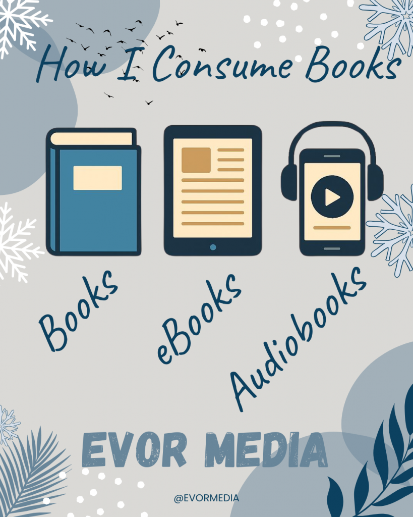
Now, books come in all sorts of formats, like physical books, e-books and audiobooks. Those would be the mainstream book formats I’m talking about. I should mention that there are also several formats for people with special needs that I won’t cover in this post, mostly because I haven’t had much exposure to them.
When I pick a book to read, I always start with the audiobook. There was a time when an audiobook might not be an option, but now I’m always surprised when a book doesn’t have an audiobook version. I start with the audiobook because it gives me a, low effort, overview of the book. It helps me decide if it’s worth investing more time into reading and if it goes deep enough on a specific topic.
The audiobook overview is super helpful, especially since I don’t usually read the whole book. In non-fiction, the author often spends a lot of time explaining and promoting their theory. If I’m already familiar with and have bought into the author’s theory, I’ll often skip those sections. The audiobook’s magic is that it lets me know where to skip ahead.
I’ve noticed that non-fiction books can be quite large and heavy, making them a hassle to carry around. This often leads me to leave the book at home, which reduces my chances of reading them. That’s where e-readers come in. They’re so convenient that I can carry many of those bulky books in my pocket. Plus, they offer great lighting in dim conditions and last weeks on a single charge. Another great thing about e-readers is that they’re pretty distraction-free, which is perfect for reading.
So, if a non-fiction book has been great in the audiobook, and I’ve enjoyed the e-book, you might think I’m done with it. But you’d be wrong! I almost always buy the physical paper book. It might seem a bit strange, but audiobooks and e-books aren’t really great for looking up information. If a non-fiction book has really added value, I like to have it on my shelf with pages marked and highlighted for easy reference.
I know this sounds a bit much, but you’re right—I buy the book three times! Plus, it really helps me support the author, which might encourage them to write more books.
In 2013, this was supposed to change everything. Not the phone in your pocket, not social media, not even “the cloud” in its big, abstract sense. This was about your notes. Your half-ideas. Your screenshots of things you might someday cook. Evernote didn’t sell productivity so much as salvation. Its promise—“Remember Everything”—landed with a quiet confidence, as if forgetting had finally been identified as a bug, and software was here with the patch. No more lost thoughts. No more scattered notebooks. No more wondering where that one important idea went. Your brain, but searchable.
Evernote emerged at a very specific moment in tech history, right after the iPhone taught us that software could live with us, follow us, and politely buzz in our pockets. Suddenly everything felt recordable. Photos, locations, messages, receipts. And with that came a low-grade anxiety: what if the important stuff slipped through the cracks? Evernote didn’t frame this as a workflow problem or a productivity hack. It framed it as a cognitive crisis. Your mind was overloaded. Evernote would remember for you. Investors loved this framing. At the time, it solved exactly zero concrete problems, but it felt important—and in Silicon Valley, that often counts as traction.
The pitch was breathtakingly broad. Evernote was for students and CEOs, journalists and chefs, researchers and people who clipped recipes they would never make. You could store text, PDFs, images, audio, handwritten notes, web pages—if it could exist digitally, Evernote wanted it. The app didn’t so much suggest a use case as dare you to imagine one. This was not a tool; it was an empty warehouse with very good lighting. You were free to build whatever system you wanted inside it, provided you enjoyed building systems in your spare time.
And for a while, people did. They downloaded Evernote. They scanned a receipt or two. They saved an article. They created a notebook, maybe even two. One of them was almost certainly called “Stuff.” Tagging was attempted, briefly, with the kind of optimism usually reserved for New Year’s resolutions. Then something interesting happened: nothing. Evernote quietly filled up, while usage quietly tapered off. The app didn’t break. It didn’t crash. It just waited. Like a very polite filing cabinet that never reminded you why you opened it in the first place.
The core problem wasn’t storage. Storage is easy. The problem was retrieval. Evernote assumed that future-you would remember to search for past-you’s thoughts, and that past-you had labeled them in a way future-you would find intuitive. This turns out to be a bold assumption. Evernote didn’t eliminate forgetting; it merely moved it one step to the left. You no longer forgot the idea—you forgot that you saved it. Which is arguably worse, because now you feel like the failure, not your memory.
At its heart, Evernote was a solution in search of a behavior change. It required discipline, foresight, and a strange optimism about your future self’s organizational instincts. It asked users to care—deeply—about information they didn’t yet need. Most people don’t want a second brain. They want fewer things rattling around in the first one. Evernote wasn’t wrong about information overload, but it overestimated our desire to personally manage the solution.
And yet, it wasn’t a failure in the way tech failures usually are. Evernote found its people. Journalists used it as a reporting archive. Lawyers kept case notes. Therapists stored session records. Some users built astonishingly detailed life logs—years of receipts, ideas, photos, meticulously tagged and searchable. Evernote didn’t become universal, but it became foundational. It trained an entire generation to expect that notes should sync, search instantly, and accept almost anything you threw at them.
You can see its DNA everywhere now. In Apple Notes’ quiet competence. In Notion’s structured ambition. In Obsidian’s graph-obsessed minimalism. Evernote walked so these tools could gently ask you what you’re trying to do before offering seventeen options. In that sense, Evernote didn’t fail—it overexplained, and the market learned to prefer whispers.
Could Evernote work today? Technically, yes. Modern AI eliminates many of the frictions that doomed it: automatic tagging, semantic search, contextual resurfacing. But the core assumption still struggles. Most people don’t want to manage memory. They want memory managed for them. The winning tools don’t ask you to build a system; they quietly become one.
Evernote’s real lesson isn’t about notes. It’s about ambition. It wanted us to become archivists of our own lives, curators of every passing thought. Most of us just wanted to remember where we parked. And maybe that’s okay. Technology doesn’t win by being powerful—it wins by being invisible. Evernote was brilliant, thoughtful, and slightly too earnest. It didn’t just try to remember everything. It tried to make us care.
Let’s get one thing out of the way: the Apple Magic Mouse is controversial. Some people love it. Some people love to hate it. But after using a dozen different mice over the years—from ergonomic monsters to gaming beasts—there’s something about the Magic Mouse that keeps pulling me back.
And honestly? It might just be one of the most underrated tools in Apple’s entire lineup.
Let me explain.
Sleek Design, No Clutter
Let’s start with the obvious: the Magic Mouse is beautiful. It’s one of the few accessories that doesn’t just sit on your desk—it elevates it.
Its low-profile, seamless, buttonless surface looks more like a modern sculpture than a piece of tech. It’s the kind of thing that makes your workspace feel clean, intentional, and—dare I say—calm. There’s no visual noise. Just elegant simplicity.
And yes, design matters. When your tools feel good to look at and touch, you’re just more inclined to use them.
The Touch Surface: Underrated Genius
This is where the Magic Mouse really shines.
While most mice stick to the basics—left click, right click, scroll wheel—the Magic Mouse gives you a full touch-sensitive surface that supports gestures:
Swipe between full-screen apps with two fingers
Scroll vertically and horizontally like a trackpad
Double-tap with two fingers to bring up Mission Control
It’s like having a little Magic Trackpad built right into your mouse. And once you get used to it, traditional scroll wheels feel… primitive. Scrolling through long docs or design canvases feels buttery smooth and oddly satisfying.
Seamless with macOS
The Magic Mouse is built to feel native to the Mac experience. That means it just works—no third-party drivers, no setup, no fiddling. It syncs effortlessly via Bluetooth, and macOS recognizes it immediately.
You also get perfect integration with macOS gestures, accessibility settings, and system-level precision. If you’re working across multiple displays or virtual desktops, that gesture support becomes your secret productivity weapon.
The Battery That Doesn’t Quit
Yes, —we all know about the infamous underside charging port. It’s weird. We get it.
But here’s the thing: you almost never need to charge it.
The Magic Mouse’s battery life is wild. A full charge lasts weeks, and even a quick 2-minute juice-up gives you hours of use. I literally forget it needs power until I get the pop-up, and by then, I just plug it in while I get coffee. Crisis averted.
Perfect for Minimalists and Travelers
If you’re the kind of person who likes to travel light or keep your desk minimalist, the Magic Mouse is a dream. It’s thin, light, and takes up almost no space in a bag or on a desk.
No extra dongles. No bulky grips. No ridiculous LED lighting schemes. Just one sleek device that fits into your Apple ecosystem like it was born there—because it was.
Okay, But What About Ergonomics?
Fair point. If you have wrist or hand issues, or you spend 10+ hours a day using a mouse, the Magic Mouse might not be the most ergonomic option. Its flat design doesn’t offer the same palm support as a vertical or sculpted mouse.
But here’s the thing: if you mix in gestures, trackpad use, or a keyboard-first workflow, the Magic Mouse actually reducesrepetitive motion. It encourages more finger movement and less wrist drag.
And if you pair it with a wrist rest or a slight angle stand, it becomes surprisingly comfortable over long sessions.
Final Thoughts: More Than Just a Pretty Mouse
The Magic Mouse isn’t for everyone—and that’s okay. But if you value elegance, multi-touch functionality, and deep integration with macOS, it’s a lot more powerful than it looks.
It’s the kind of tool that disappears into your workflow. It doesn’t demand attention, it just works—quietly, beautifully, and reliably.
So if you’ve been on the fence (or heard the haters), maybe give it another shot. You might be surprised at how magical it actually feels.
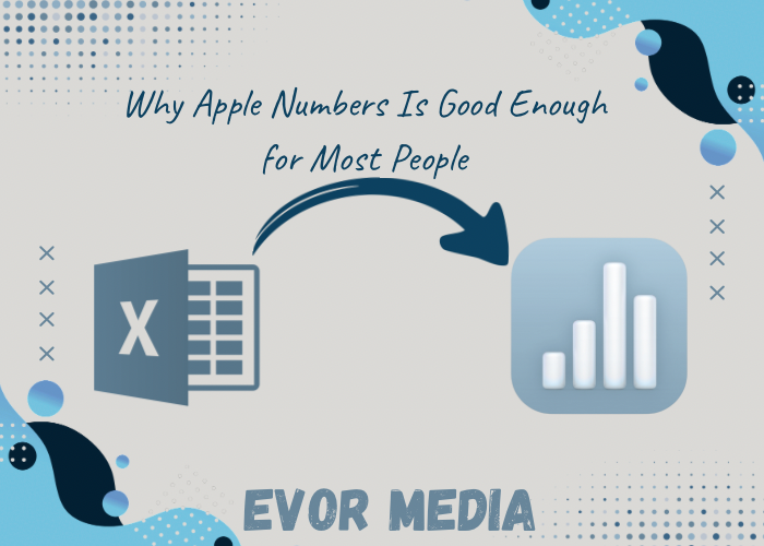
When people think about spreadsheet software, the name that usually comes to mind is Microsoft Excel—and for good reason. It’s been around for decades, it’s incredibly powerful, and it’s widely used in industries ranging from finance to engineering. But what if you’re not a financial analyst or data scientist? What if you just want to organize your personal finances, track a project, or build a clean-looking chart?
Here’s the truth that many tech-savvy people won’t say out loud: Apple Numbers is more than good enough for most users. In fact, for a large number of people, it’s the better choice.
This post explores why Numbers is a perfectly capable spreadsheet tool for everyday use, what makes it different from Excel, and why learning to use it is a smart and practical decision—especially if you’re already embedded in the Apple ecosystem.
1. Numbers Has a Clean, User-Friendly Interface
The first thing you’ll notice about Apple Numbers is its focus on design and simplicity. Unlike Excel, which opens with a dense grid of cells, Numbers greets you with a blank canvas. You can place tables, charts, images, text, and shapes wherever you want on the sheet.
This layout is more visual and less intimidating, especially for beginners or casual users. Think of it as a hybrid between a spreadsheet and a presentation tool. It’s particularly helpful when you’re:
Creating reports that mix data with narrative
Designing budgets you actually want to look at
Laying out planners or checklists
Building interactive dashboards
Apple designed Numbers to help you tell a story with your data—not just crunch it.
2. Most People Don’t Need Excel’s Power Features
Yes, Excel is incredibly powerful. It can handle:
Massive datasets
Pivot tables
Macros and scripting
Complex business intelligence functions
But how many people actually use those features?
If you’re a:
Student tracking assignments
Freelancer creating an invoice
Homeowner managing a renovation budget
Parent organizing a family schedule
Entrepreneur building a basic inventory
…then Numbers probably offers everything you need, and more.
For basic to intermediate needs, Numbers offers:
Over 250 built-in functions
Intuitive charts and graphs
Conditional highlighting
Data validation
Drop-down menus and sliders
Easy-to-build formulas
It’s less about deep complexity and more about smart design that meets everyday needs with minimal effort.
3. It’s Free and Already on Your Apple Devices
One of the strongest cases for using Apple Numbers is simple: you already own it.
If you have a Mac, iPad, or iPhone, Numbers comes free. You don’t have to pay for a subscription, deal with licensing, or worry about updates—it’s part of Apple’s iWork suite, just like Pages and Keynote.
This makes it incredibly accessible to:
Students on a budget
Small business owners
Nonprofits
Casual users
On the other hand, Excel is part of the Microsoft 365 subscription, which costs $70–100+ per year for individuals. For those who don’t need the full power of Excel, that’s money better spent elsewhere.
4. Beautiful Output With Minimal Work
Numbers makes it easy to create polished, professional-looking spreadsheets. Fonts, spacing, color palettes, and chart styles all have that clean, modern Apple look right out of the box.
No fiddling with clunky formatting. No battles with text wrapping or alignment.
Want to create a budget that doesn’t look like it came from a 1997 accounting textbook? Numbers can help you do that with:
Built-in templates for budgets, planners, invoices, and more
Drag-and-drop layout control
Transparent backgrounds for charts (great for presentations)
Instant chart previews and formatting
If you need to present data visually—to a client, your boss, or even just yourself—Numbers helps your work shine without extra effort.
5. Seamless Integration Across Devices
Numbers is tightly integrated into Apple’s ecosystem. Your spreadsheets are automatically saved to iCloud, so you can open and edit them across your:
Mac
iPad
iPhone
Web browser via iCloud.com
Start a spreadsheet on your iPhone while commuting, tweak it on your Mac at home, and present it on your iPad during a meeting. It’s seamless.
And thanks to iCloud sharing, collaborating with others is simple—no emailing attachments back and forth. You can invite others to view or edit your spreadsheet in real time, with changes synced instantly.
6. It Plays Nicely with Excel (Most of the Time)
Many people avoid Numbers because they’re worried about compatibility. What if a colleague sends you an Excel file? What if you need to share a file with someone who doesn’t use Numbers?
The good news is: Numbers can open, edit, and export Excel files (.xlsx). While some complex macros or custom formatting might not carry over perfectly, for standard spreadsheets, the transition is usually smooth.
In practice:
You can import Excel files into Numbers and edit them
You can export Numbers files to Excel when needed
You can collaborate with Excel users by converting files before sending
For day-to-day needs, this makes Numbers flexible and cooperative, not isolating.
7. Learning Numbers Is Easier Than You Think
Because of its clean design and intuitive features, Numbers is easier to learn than Excel—especially if you’re new to spreadsheets.
You don’t need to take a course or read a manual. In fact, you can start creating meaningful documents within minutes just by experimenting with:
Tables and charts
Built-in templates
Simple formulas like SUM(), AVERAGE(), IF()
Interactive elements like sliders and checkboxes
And if you do want to go deeper, Apple offers excellent (and free) tutorials through:
Apple Support
Apple’s YouTube channel
Online communities and forums
Built-in help features
In short: the learning curve is gentle, and the payoff is immediate.
When You Shouldn’t Use Numbers
To be fair, Numbers isn’t perfect for every situation. You might be better off with Excel if you:
Work with massive datasets
Use advanced financial modeling tools
Depend on pivot tables, Power Query, or macros
Build database-driven spreadsheets
But for the average user—especially within the Apple ecosystem—Numbers is a delightfully capable and refreshingly modern alternative.
Conclusion: Numbers Deserves a Second Look
Apple Numbers might not be the loudest name in spreadsheets, but it quietly does what most people need—and it does it beautifully, simply, and for free.
So if you’ve ignored it or dismissed it in the past, give it another shot. Take the time to explore a few templates, learn a handful of formulas, and build something that makes your life easier.
Chances are, you’ll find that Numbers isn’t just good enough—it’s exactly what you needed all along.
Latest Blog Posts
Stay informed and inspired with our latest blog posts. Discover insights, tips, and trends across various topics.
Why an iPad Air & Mac Mini is a Productivity Powerhouse
I’ve been reflecting on my technology setup, balancing productivity and entertainment. My daily drivers are a MacBook Pro and a ridiculously priced iPad Pro. While the iPad Pro is great, it didn’t need to be a Pro. I’m not sure who the iPad Pro users are, but I’ve realized I’m not one of them.
It’s time to update these tech pieces. Now, I’ll confess: my MacBook is docked 95% of the time to a monitor, keyboard, and mouse. Before you continue, I’d like to ask you to share your docking habits. I suspect yours are similar.
For years, the debate raged: do you get a laptop for portability or a desktop for raw power? What if I told you there’s a third, arguably more elegant and cost effective, option? Enter the dynamic duo: the iPad Air and the Mac Mini.
This isn’t just a compromise; it’s a strategic pairing that gives you the best of both worlds. You get the untethered freedom and tactile brilliance of the iPad, combined with the steadfast power and desktop rigour of the Mac. Let’s break down how to build this perfect setup.
The Philosophy: Power Station meets Magic Window
Think of your Mac Mini as your “Power Station.” It’s the silent workhorse tucked away on your desk, handling heavy-duty tasks: video editing, complex spreadsheets, software development, 3D modelling, animation, CAD designs, video editing, you get the idea, managing your digital life. It’s always on, always ready.
Your iPad Air is your “Magic Window.” It’s the lightweight, versatile portal. It’s for sketching ideas, reading articles on the couch, taking notes, and even being your primary computer on the go.
Together, they create a seamless workflow that adapts to you, not the other way around.
Building Your Core Setup
1. The Heart: Mac Mini
The Mac Mini is the foundation. For most users, the standard M4 chip is more than enough, offering incredible performance for daily tasks, photo editing, and even some 4K video work. If you’re a power user — working on 3D modelling, a musician with large sample libraries, or a video editor working with ProRes files—the Pro chip upgrade is a worthy investment.
Why it works: It provides desktop-level performance with a tiny footprint, leaving you plenty of room on your desk for your iPad and other accessories.
2. The Soul: iPad Air
The iPad Air is the star of the show. With the M series chip, it has the horsepower to not only be a fantastic tablet on its own but also a brilliant companion to the Mac.
Why it works: The power parity between the two devices is key. They “understand” each other, making features like Universal Control and Sidecar incredibly fluid.
The Essential Accessories That Tie It All Together
This is where the magic happens. The right accessories transform two separate devices into one cohesive system.
For the Mac Mini Desk Setup:
Monitor: A 27-inch 4K monitor will give you the perfect canvas to create, although a 32” monitor might be an even better fit.
Keyboard & Mouse: The Apple keyboard with Touch ID and the Apple Magic Mouse are a great peripherals and pair seamlessly with your Mac.
For the iPad Air:
The Magic Keyboard turns the iPad Air into a legit laptop replacement with a great typing experience and a trackpad. If you prioritize drawing, the Magic Keyboard, combined with the Apple Pencil is a fantastic alternative.
Apple Pencil: This is the iPad’s secret weapon. For note-taking, sketching, marking up PDFs, or even fine photo edits, the Apple Pencil is transformative.
Stand: A sturdy stand is perfect for holding your iPad at the perfect angle next to your monitor.
The Software Magic: Making Them Work as One
Hardware is nothing without software. Apple’s ecosystem features are the glue.
1. Universal Control: This is the killer feature. With your iPad placed next to your Mac, you can seamlessly move your cursor from your Mac’s screen onto your iPad’s screen. You can drag and drop files, links, and text between them as if they were one system. No setup required—it just works.
2. Sidecar: Turn your iPad Air into a wireless, high-quality second display for your Mac. Perfect for keeping your email or Slack on the iPad while you work on the main monitor, or for using it as a dedicated palette for tools in Photoshop or Final Cut Pro.
3. Continuity Features:
Handoff: Start an email on your Mac, pick it up on your iPad.
AirDrop: Instantly send files between devices.
Universal Clipboard: Copy text or an image on one device, paste it on the other.
4. iCloud Sync: Your Documents, Desktop, and Photos library can be stored in iCloud, meaning all your essential files are available on both devices instantly.
Sample Workflows in Action
Let’s see how this setup comes to life:
The Creative Pro:
On the Mac: Edit a 4K video project in Final Cut Pro using the full power of the M series chip and your large monitor.
On the iPad: Use Sidecar to extend your timeline or use the iPad as a dedicated viewer. Pick up the Apple Pencil and use the iPad natively with the Freeform app to sketch storyboards, which are saved to iCloud and instantly available on your Mac to import.
The Student/Researcher:
On the Mac: Write a research paper in Word or Scrivener with multiple PDF sources open on the big screen.
On the iPad: Use Universal Control to drag relevant quotes from a PDF on the iPad directly into your document on the Mac. In a lecture hall, use the iPad with the Apple Pencil to take handwritten notes in Apple Notes.
The Remote Worker:
On the Mac: Use the powerful multi-tasking for Slack, Excel, and a browser with 20+ tabs.
On the iPad: Take your “desktop” to the couch to review documents or join a Zoom call with the excellent front-facing camera. Use Sidecar to keep your personal messages visible on the iPad while you present from your Mac.
The Verdict
The iPad Air and Mac Mini setup is more than the sum of its parts. It’s a declaration that your computing experience shouldn’t be confined to a single form factor. It offers unparalleled flexibility, cutting-edge performance, and a seamless flow that lets you focus on your work and creativity, not on managing cables and files.
It’s not just a setup; it’s a system designed for how we actually work and live today—fluidly moving between focused desk work and mobile inspiration.
Ready to build yours? The journey to a clutter-free, powerful, and perfectly portable digital life starts here.
Latest Blog Posts
Stay informed and inspired with our latest blog posts. Discover insights, tips, and trends across various topics.