
Snorewood, Ontario, a town of 15,000, is nestled on the northern shore of Lake Ontario. The town boasts a charming downtown with historic brick buildings, eleven coffee shops, and a beautiful beach. Despite being dubbed the “second best beach in southern Ontario,” Snorewood embraces its position with pride.
Snorewood – Official trailer
A bedtime podcast told in gentle, unhurried episodes. Each episode takes place over the course of a single evening in Snorewood — following the town’s residents as they wind down, close up shop, and drift toward sleep. Nothing dramatic ever really happens in Snorewood. That’s the whole point. The humour is soft, the stakes are low, and the pace is slower than the lineup at the new artisanal pour-over place on Birch Street that only seats four people.
Snorewood, Ontario. Population 15,000. Founded 1847. Twinned in 1987 with a town in France that nobody in Snorewood has ever visited, though the sign outside Town Hall mentioning it is freshly repainted every spring.
The town sits on the northern shore of Lake Ontario, roughly equidistant between Toronto and Montreal — close enough to both cities that residents feel cosmopolitan, far enough that they really, genuinely are not. The lake is enormous and dark and beautiful at night, and on very clear evenings you can almost convince yourself you can see the far shore, though you cannot.
Downtown Snorewood is four walkable blocks of century-old brick storefronts. It has a hardware store, a pharmacy, a used bookshop, a seasonal ice cream stand that operates eleven months of the year because the owner, Deborah, tried closing for January once and felt strange about it. And it has coffee shops. Many, many coffee shops. At current count, eleven. For a town of 15,000. Nobody is sure how this happened or how they all survive. Economists from Queen’s University have driven through and frowned.
Two blocks south of downtown, the beach begins. Fine sand, a long wooden pier, a snack bar that closes at six. In summer the tourists come. In winter the lake freezes in strange formations along the shore and the locals walk out onto the ice and stand there quietly, which is a very Snorewood thing to do.
From Radio Dramas to Podcasts
What Changed…and What Didn’t
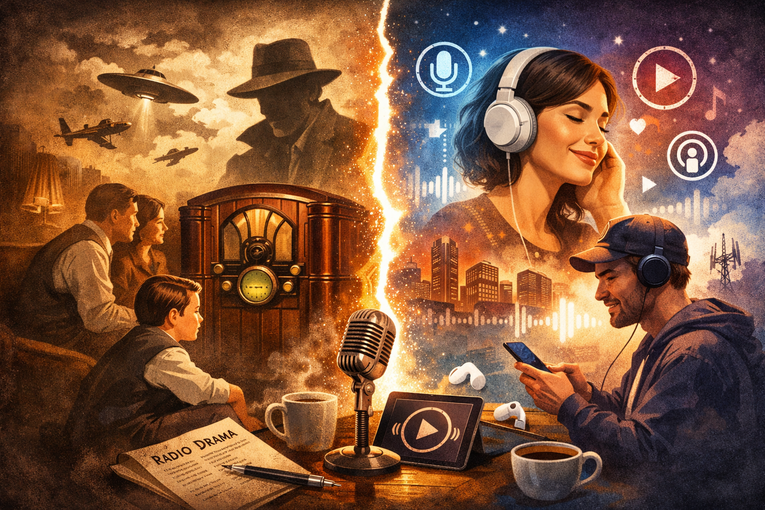
There was a time when families would gather around a radio, waiting for a story to begin
- Not scrolling.
- Not skipping.
- Waiting.
In the 1930s and 40s, radio dramas weren’t just entertainment—they were events. Shows like The Shadow radio program and The War of the Worlds broadcast captured the imagination of millions. People sat together, listening closely, building entire worlds in their minds from nothing but sound.
Today, we live in what feels like a completely different universe. Podcasts stream on demand. Audiobooks follow us everywhere. Voices live in our ears through devices like Apple AirPods.
But when you strip away the technology, something surprising becomes clear:
- A lot has changed.
- And almost nothing has.
What Changed: Control, Convenience, and Choice
The biggest shift from radio dramas to podcasts is simple: control.
In the golden age of radio, you listened when the show aired. Miss it, and it was gone. That limitation created a kind of shared rhythm—entire cities tuned in at the same time.
Today, podcasts have flipped that entirely.
- Listen anytime
- Pause, rewind, skip
- Choose from millions of shows
Platforms like Spotify and Apple Podcasts have made audio deeply personal. Your listening habits are no longer shaped by a broadcast schedule—they’re shaped by you (and, increasingly, by algorithms).
It’s better in almost every measurable way.
But it’s also different in ways that are harder to measure.
What Changed: From Shared Rooms to Personal Spaces
Radio was a room experience.
Podcasts are a headphone experience.
That shift—from speakers to earbuds—quietly transformed how we connect through audio. What was once communal is now individual. We’ve traded the living room for the inside of our own heads.
We don’t gather to listen anymore.
We listen alone—together, but separate.
And while that independence is powerful, it comes with a subtle cost: fewer shared moments.
What Didn’t Change: The Power of Voice
Despite all the technological change, the core of audio storytelling remains exactly the same…a voice, telling a story.
Whether it’s a 1940s announcer leaning into a microphone or a modern podcast host speaking into a USB mic, the connection is still deeply human. Audio has an intimacy that video often lacks.
There’s no screen to distract you.
No visuals to define things for you.
Just voice—and your imagination filling in the rest.
That hasn’t changed at all.
What Didn’t Change: Imagination Does the Heavy Lifting
One of the most powerful things about radio dramas was what they didn’t show you.
There were no visuals—only suggestion. A creaking door. Footsteps in the dark. A pause in someone’s voice…your mind did the rest.
Podcasts—especially narrative ones—still rely on that same magic. Even today, the best audio stories don’t overwhelm you with detail. They leave space.
Space for you to imagine…space for you to participate.
In a world dominated by screens, that feels almost radical.
The Middle Ground We’re Still Figuring Out
If radio was communal and podcasts are personal, we’re still trying to figure out what comes next.
We have the tools to bring shared listening back—smart speakers, voice assistants, multi-room audio. Devices like the
Apple HomePod smart speaker can easily fill a room with sound.
But the habit isn’t there:
- We’ve grown used to listening alone.
- Curating our own tastes.
- Rarely compromising on what we hear.
And yet, there’s something missing.
A Small Experiment in Shared Listening
My wife and I have stumbled into a small way of reclaiming that lost connection.
When we go for walks, we share a single pair of AirPods—she takes the right, I take the left—and we listen to the same podcast.
It’s a simple thing. Almost silly.
But it creates moments that feel surprisingly rare: both of us reacting at the same time, stopping mid-step, looking at each other after hearing something that lands.
That shared reaction—that unplanned, synchronous moment—is something radio listeners in the 1940s would have recognized instantly.
The Real Difference
So what really changed?
- Not the storytelling.
- Not the voice.
- Not the imagination.
What changed is how we experience it together.
Radio made listening a collective ritual.
Podcasts made it a personal habit.
Neither is inherently better. But one of them brought people into the same moment—and the other lets us drift into our own.
Final Thoughts
We didn’t lose the magic of radio when podcasts arrived. In many ways, we expanded it.
We just redistributed it—from the room to the individual.
Maybe the next evolution of audio isn’t about better technology or smarter algorithms.
Maybe it’s about rediscovering something much older:
Listening, not just at the same time—
but together.
The Golden Age of Radio vs. The Golden Age of Audio:
What We’ve Lost (and How to Get It Back)
I’ve had a long-standing romance with old-time radio, especially the magic of the 1940s. Sometimes it feels like I was born in the wrong era. There’s something deeply compelling about the image of a family gathered around a beautiful wooden console radio, completely immersed in a shared story.
The Magic of 1940s Radio
In the 1940s, radio wasn’t just background noise, it was an event.
Families would gather around large console sets like the Zenith 12S471 floor console radio, tuning in to dramas, comedies, and news broadcasts. Each listener imagined the scenes differently, yet everyone experienced the same story at the same time. That balance, individual imagination paired with collective experience—was the true magic of the golden age of radio.
It was simple. It was shared. And it was powerful.
Today’s Golden Age of Audio
Fast forward to today, and we’re living in what could easily be called the golden age of audio. Podcasts, audiobooks, and streaming music are more accessible than ever. Devices like the Apple AirPods and Apple HomePod smart speaker have made listening effortless and ubiquitous.
But here’s the paradox: while access has improved, connection has diminished.
Wireless headphones have revolutionized how we consume audio, but they’ve also quietly isolated us. We’ve become a society of solo listeners, each in our own personalized audio bubble.
The Problem with Personalized Listening
The convenience of earbuds has shaped our habits in subtle ways:
- We listen alone, even when we’re together
- Algorithms replace shared discovery
- Audio becomes individualized instead of communal
There was a time when discovering new music or shows meant listening with others, friends, family, even strangers. Today, algorithms are more efficient, but they lack the human element that made discovery meaningful.
A Small Rebellion: Sharing One Pair of Headphones
My wife and I have found a small way to push back against this trend.
When we go for walks, we could easily each put in our own headphones and listen to separate things. But we don’t.
Instead, she uses the right AirPod, and I use the left. We listen to the same podcast or audiobook, together.
It sounds trivial, but it changes everything.
We’ve had moments where we both stop walking at the exact same time, hearing a powerful “mic drop” moment, and just look at each other. No words needed. That shared reaction is something you simply don’t get when listening alone.
That’s the missing ingredient in today’s golden age of audio: shared experience.
Could Smart Speakers Bring It Back?
There’s hope.
Devices like smart speakers make it possible to recreate that communal listening experience. It’s not hard to imagine a modern version of a 1940s living room, family or friends gathered around, listening to an audio drama after dinner.
Maybe it’s a podcast. Maybe it’s an audiobook. Maybe it’s something entirely new.
The technology is here.
The habit is not.
When Radio Became Television
There’s an interesting parallel from history.
In the 1950s, as television emerged, many successful radio shows transitioned to the new medium. But something was lost in translation.
My father, who grew up in the 1940s, once told me about the disappointment of seeing his favorite radio characters on television. The faces on the screen didn’t match the ones he had imagined.
Radio invited participation. Television replaced it.
Why 1940 Was the Peak
If there was a peak moment for radio, it was likely around 1940.
Radio rose in the mid-1920s and began fading by the early 1950s as television took over. By the late 1940s, broadcasters were already shifting their focus away from radio. That makes 1940 a kind of sweet spot—when the medium was mature, widely adopted, and still culturally dominant.
It’s no coincidence that iconic radios like the Zenith 12S471 came from this era. They weren’t just appliances, they were the centrepiece of the home.
Recreating the Golden Age Today
Maybe I’m romanticizing the past. Probably.
But I can’t shake the vision of a near future where we reclaim some of what made that era special.
A quiet evening. A cup of tea or coffee. A room filled with people. And a story playing, not through isolated earbuds, but out loud, shared.
Maybe it’s through a modern speaker instead of a wooden console. Maybe the content is a podcast instead of a radio drama.
But the feeling?
That could be the same.
Final Thoughts
We didn’t lose the magic of audio—we just changed how we experience it.
The golden age of radio was about togetherness.
The golden age of audio is about choice.
The next evolution might be about finding a way to have both.
And maybe it starts with something as simple as sharing a single pair of headphones.
Stop Trying to Turn Your iPad Into a Laptop
It’s not. And it never will be.
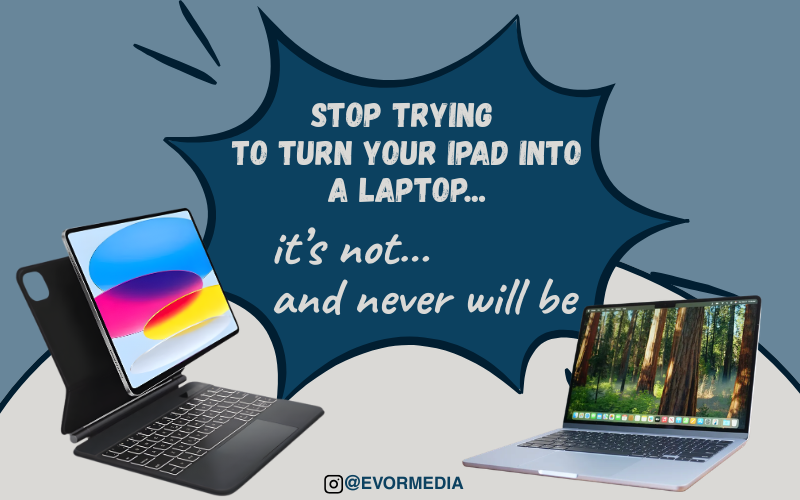
This might sound harsh, especially if you’ve invested a lot of money in an iPad setup, perhaps even pairing it with an Apple Pencil and the expensive Magic Keyboard. It seems like you should be able to replace your laptop entirely.
However, the reality is that adding a keyboard doesn’t magically transform an iPad into a laptop. It simply turns it into an iPad with a keyboard.
The Promise vs. The Reality
The iPad is an incredible device, thin, light, fast, and incredibly versatile.
It can serve as:
- A sketchbook
- A notebook
- A media consumption device
- A portable creative studio
Yes, with the right accessories, it can resemble a laptop. But resemblance isn’t replacement.
I recently tried connecting a keyboard and mouse to my iPad Pro, testing apps and working like I would on a traditional computer. That’s when the limitations became apparent.
Apps like Affinity Designer and Procreate, two of the most powerful creative tools on the platform, are designed for touch. They expect your fingers and the Apple Pencil.
Using them with a keyboard and mouse feels like driving a car with a joystick. It technically works, but it’s not what the experience was intended for.
Even with a trackpad, which helps with gestures like zooming, you’re still fighting the system instead of flowing with it.
The Universal Device Myth
- I used to dream of a single, all-in-one device that could do everything: a laptop, a tablet, a creative tool, and a productivity hub.
However, the more I experimented, the more I realized that such a device doesn’t exist. Even if it did, it would likely be mediocre at everything. It would be good at everything, but not great at anything—that’s the trade-off.
Apple Knows This (And Benefits From It)
Apple isn’t trying to replace your Mac with an iPad. Instead, they’re creating a system that encourages you to want both.
Their ecosystem is designed around continuity, ensuring a seamless experience between devices.
Start a note on your Apple Watch, add it to your iPhone, and finish it on your iPad. Everything works seamlessly together, and yes, that’s incredibly convenient, but it’s also strategic.
Apple makes its money by selling multiple devices, not by convincing customers that one device can do everything.
The MacBook vs. iPad Debate Is Backwards
Spend five minutes on Reddit, and you’ll see the same argument repeatedly: “Just get a MacBook Air; it does more than an iPad.” Every time, it feels like we’re asking the wrong question because, in many ways, the iPad is actually more versatile.
Consider input options alone: touch, Apple Pencil, keyboard, mouse, and trackpad. That’s three, arguably four, different ways to interact with the same device. Compare that to a Mac: keyboard and mouse/trackpad. That’s it.
So, instead of asking, “Should I get a Mac instead of an iPad?” maybe the better question is, “I’m getting an iPad… do I also need a Mac?”
Flip the Default Thinking
Most people buy a MacBook as their main computer and add an iPad later for specific tasks. I think that’s backwards. Try this instead: start with an iPad as your daily device and add a Mac only if you hit a specific limitation. Those limitations are real. Certain workflows, file management, pro-level software, multitasking, and development work are still far better on a Mac.
But not everyone needs those things every day.
Use the iPad for What It Is
The mistake isn’t buying an iPad; the mistake is expecting it to behave like something it’s not.
- The iPad truly shines when you use it naturally, embrace the Apple Pencil, and adopt app-first workflows. However, it struggles when you force desktop habits onto it, expect full laptop-style multitasking, or try to replicate macOS workflows.
If you’re considering an iPad, remember this: if you’re reading this, it’s already on your mind. So, here’s my simplest advice: don’t buy it to replace your laptop. Instead, buy it to do things your laptop can’t do as well.
This is because when you stop trying to turn it into a Mac, the iPad truly becomes great. Perhaps that’s the real shift: not asking, “Can the iPad replace my laptop?” But instead, “What kind of computing experience do I actually want?”
The Machine That Captured Imagination:
A 1947 SEARS RADIO-PHONOGRAPH
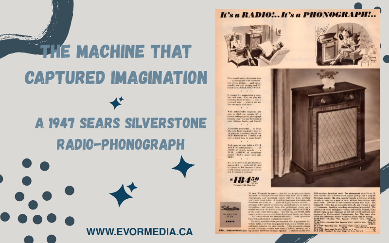
There’s something magical about flipping through an old Christmas catalog, especially one from 1947. Back then, technology wasn’t something you upgraded annually; it was a significant investment. It became a part of your home, your family, quietly shaping your memories.
One item that caught my eye was a combination radio-phonograph from Sears. Priced at $184.50, that’s just over $3,000 today, a substantial purchase in the years following World War II. This wasn’t an impulse buy; it was a statement, a centrepiece, a promise of connection, entertainment, and perhaps even a touch of wonder.
And honestly, it delivered all of that and more.
A Radio… and a Phonograph… and Something Entirely New
Sears didn’t just sell this as furniture or an appliance; they sold it as an experience.
“It’s a radio… it’s a phonograph… and sensationally new… it’s a wire recorder.”
That last part is what makes this machine so captivating. We take recording for granted today, with our phones capturing hours of audio in seconds. But in 1947, the idea of recording anything radio broadcasts, your favourite records, or even your own voice and playing it back instantly felt like science fiction.
This system used a thin strand of stainless steel wire, magnetized to store sound. No discs, no grooves, no needles. Just 7,500 feet of wire spooling through the machine, capturing moments as they happened.
The promise was bold:
- Record a full hour without interruption
- Replay it instantly
- Erase it and reuse it repeatedly
- Listen to it thousands of times with barely any loss in quality
It wasn’t just playback; it was preservation.
A Window Into Another World
My father, born in 1942, was a child of the golden age of radio. He often reminisced about lying on the floor, completely absorbed in his favourite programs.
No screens, no visuals—just sound and imagination.
When I read this catalog description, I can’t help but picture him there. Perhaps in a dimly lit living room, the glow of vacuum tubes warming a polished wooden cabinet. A radio like this one filled the space with stories, music, and voices from far away.
This wasn’t passive entertainment. It demanded participation. You had to listen, and in doing so, your mind crafted worlds, faces, and scenes from nothing but sound.
That’s something we’ve lost a bit of today.
Built Like It Mattered
Everything about this machine reflects a different philosophy of technology. It boasted:
- Six-tube radio performance (plus two more for the recorder)
- Large 10-inch dynamic speaker
- Full-range tone control and automatic volume control
- Built-in antenna
- Phonograph capable of playing 10- and 12-inch records
All housed in a beautifully finished mahogany cabinet.
This wasn’t just electronics; it was furniture. It had presence, belonging in your home alongside a piano or dining table.
Even the futuristic wire recorder came with practical touches: high-speed rewind, automatic shutoff, and a simple interface that Sears claimed even a child could operate.
The Real Value Wasn’t the Technology
Reading through the description, you begin to notice something: Sears wasn’t just selling features. They were selling possibility.
The ability to:
- Capture family voices
- Preserve music collections
- Record important moments
- Create entertainment for gatherings
- Even improve “educational and business efficiency”
But beneath all that, they were truly offering something deeper—a memory.
Imagine recording your child’s voice for the first time. Or saving a favourite radio broadcast to listen to again. Or capturing a family moment that would otherwise be lost forever.
In 1947, that wasn’t just convenient; it was revolutionary.
A Different Kind of Christmas Gift
The catalog promised this would be:
“The most interesting Christmas they’ve ever had.” You can see why.
This wasn’t just a toy; it was an experience generator, a storytelling machine, a way to bring people together in a world still rebuilding itself after war.
Imagine a family gathered around it on Christmas morning, curious and excited, perhaps a bit confused about how this futuristic device worked. Slowly, they would realize its potential.
Looking back from 2026, we carry devices in our pockets that make this machine seem primitive. We stream millions of songs instantly, record hours of audio without thinking, and skip, rewind, and replay with a tap.
But here’s the thing: convenience has replaced ceremony.
Back then, listening was intentional, recording was meaningful, and owning something like this wasn’t about having the latest tech—it was about what it enabled: connection, imagination, and memory.
The Sears radio-phonograph isn’t just old equipment; it’s a snapshot of a time when technology felt magical, when capturing sound felt like capturing life itself.
And maybe that’s why it resonates so much.
Because somewhere in that description—the polished wood, the glowing tubes, the spinning wire—lies a simple idea: that the voices we hear, the music we love, and the moments we live are worth holding onto, even if it takes 7,500 feet of steel wire to do it.
Why I’m Moving On From the iPhone Mini
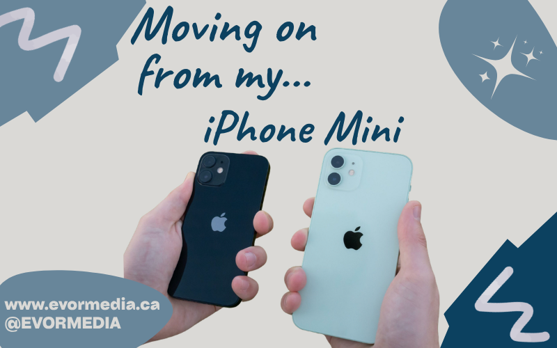
There was a time when I thought the iPhone Mini was the perfect phone.
Small. Lightweight. Effortlessly pocketable.
In a world where smartphones kept getting bigger, the iPhone Mini felt like a rebellion something designed for people who didn’t want a tablet in their pocket. And for a while, I bought into that idea completely.
But recently, something changed.
The Moment of Realization
I had to type something on my wife’s iPhone 16 (regular size) just a quick message, nothing major. But within seconds, I noticed something I hadn’t fully admitted to myself before:
The experience was… better. In every way.
The keyboard felt natural. My typing was faster and more accurate. The screen gave everything room to breathe. It didn’t feel cramped or compromised.
And then I went back to my iPhone Mini.
That’s when it hit me.
The iPhone Mini Problem No One Talks About
The truth is, the iPhone Mini user experience isn’t great.
It’s not terrible but it’s constantly compromised.
- Typing feels cramped
- Reading feels tight
- Apps feel slightly constrained
- Everything requires just a bit more effort
You adapt to it over time. You convince yourself it’s fine. But the moment you step back into a larger phone, the difference is obvious.
The iPhone Mini doesn’t feel efficient—it feels like a trade-off.
The One Thing It Gets Right: Pocketability
Let’s give it credit where it deserves it.
The iPhone Mini size is unmatched when it comes to portability.
It disappears into your pocket.
You barely notice it’s there.
It’s probably the most pocketable phone Apple has ever made.
But here’s the realization I couldn’t ignore:
Pocketability alone isn’t enough.
In fact, it might be the wrong thing to optimize for.
Why “Pocketable” Isn’t a Winning Strategy
When a technology company builds a product, it should aim to improve the experience of actually using it—not just carrying it.
The iPhone Mini excels when it’s in your pocket.
But the moment you take it out—when it actually matters—it falls short.
That’s a problem.
And maybe that’s exactly why Apple quietly moved on from the Mini lineup.
The iPhone Mini discontinued decision makes a lot more sense to me now. It wasn’t just about sales numbers—it was about priorities.
Bigger Phones Aren’t Just Bigger—They’re Better
I used to think larger phones were excessive.
Now I think they’re practical.
A standard size iPhone vs iPhone Mini isn’t just a difference in dimensions—it’s a difference in usability.
- More comfortable typing
- Better media consumption
- Easier navigation
- Less friction overall
These aren’t luxury improvements—they’re everyday improvements.
The Trade-Off I’m No Longer Willing to Make
For a long time, I told myself the smaller size was worth it.
That the inconvenience was minimal.
That I preferred simplicity.
But the reality is, I was optimizing for the wrong thing.
A phone isn’t something you just carry—it’s something you use constantly.
And I’d rather have a device that’s better 100 times a day in my hands than one that’s slightly better when it’s sitting in my pocket.
Why I’m Moving On
So I’m moving on from the iPhone Mini.
Not because it’s a bad product—but because it’s a compromised one.
It’s a device built around a single standout feature that doesn’t actually improve the core experience.
And once you notice that, it’s hard to unsee.
Final Thoughts
The iPhone Mini is a great idea.
But in practice, it’s a reminder that smaller isn’t always better—especially in technology.
Sometimes, the things we think we want (like a smaller phone) aren’t the things that actually make our daily lives easier.
And sometimes, it takes typing one message on a bigger screen to realize it.
My Dream Laptop from 1988
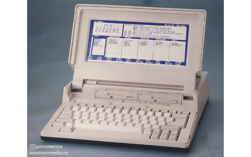
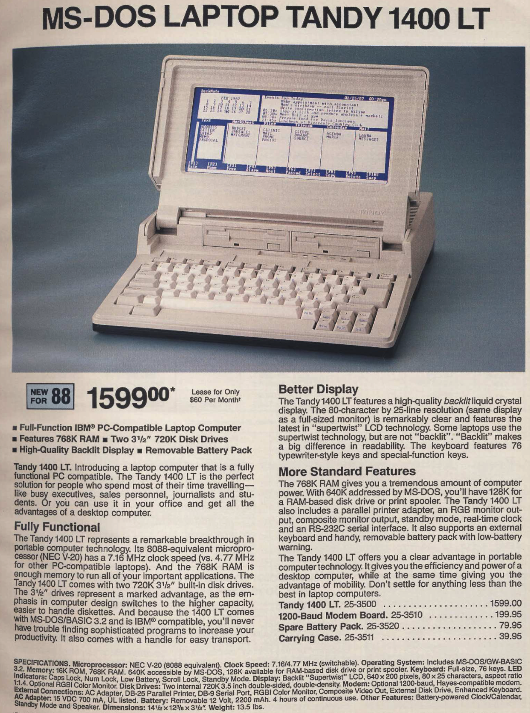
Back in 1988, the Radio Shack Tandy 1400 LT felt like magic. A portable, PC-compatible computer for $1,599 that could travel with you? That was the future. Now fast forward to 2026 and it’s almost hard to explain just how far we’ve come without it sounding unreal.
In 1988, I bought a computer not this one, mind you, which was the computer of my dreams but way out of my price range. Back then, computers weren’t something you just tossed away. They weren’t upgrades every year; they were something you invested in. And this one, for me, was the destination I always wanted to get to, but never quite did.
If blogging exists in 1988 it might have gone something like this:
The Tandy 1400 LT: I Think I Just Saw the Future
I don’t know if this is normal, but I just spent way too long staring at a laptop. Not a desktop. Not a beige box chained to a desk. An actual computer… that you can carry.
The Radio Shack Tandy 1400 LT, priced at $1,599, might be the closest thing I’ve seen to the future of computing—and I can’t stop thinking about it.
Let’s be clear: this isn’t a toy. This is a fully functional PC-compatible computer. That means real software. Word processing. Spreadsheets. The same kind of work you’d normally need a full office setup to do. Except now, you can do it… anywhere.
And that’s the part that’s messing with my head.
I keep picturing what this means. You could be on a train, in a hotel room, sitting in a coffee shop, okay maybe not coffee shop, that sounds a little extreme, but you get the idea and still be working like you’re at your desk.
Tandy is clearly aiming this at busy executives, salespeople, and journalists. And it makes sense. If your job involves moving around, this thing could change everything. No more waiting to “get back to the office” to finish something. The office comes with you now.
Of course, $1,599 is no small amount of money. For most people (including me), that’s a serious decision. But at the same time what are you really paying for here? It’s not just the hardware. It’s the freedom.
That sounds dramatic, but I think it’s true.
Up until now, computers have felt like destinations. You go to them. You sit down. You do your work. Then you leave. But the Tandy 1400 LT flips that around. Now the computer goes where you go.
And when you’re back at your desk, it still fits right in. You’re not giving anything up—you’re just gaining flexibility.
I don’t know if everyone realizes how big this could be yet. Maybe in a few years, this kind of thing will be normal. Maybe everyone will have a portable computer and we’ll wonder how we ever lived without them.
Or maybe this is just an expensive experiment.
But standing here in 1988, looking at the Radio Shack Tandy 1400 LT, it really feels like we’re on the edge of something.
And I kind of want in.
Now for the 2026 blogpost:
Power: From Basic Tasks to Everything Machines
The Radio Shack Tandy 1400 LT was built for word processing, spreadsheets, and simple programs. That alone was impressive at the time.
Today’s laptops don’t just handle those tasks they make them feel trivial. A modern machine can edit 4K video, run complex simulations, host virtual meetings, and manage dozens of apps at once without breaking a sweat.
What once required a dedicated office setup now happens instantly, often in the background.
Portability: From “Portable” to Effortless
In 1988, “portable” meant something you could carry if you really needed to. The Tandy 1400 LT was compact for its time but it still felt like equipment.
In 2026, laptops are thin, light, and designed to disappear into your life. You don’t plan around carrying them—they just come with you. Some are lighter than a textbook and more powerful than entire offices from the late ’80s.
The idea of “bringing your computer with you” isn’t special anymore it’s expected.
Battery Life: From Limited Sessions to All-Day Use
Early laptops like the Tandy were constrained by battery technology. You planned your work around power availability.
Today, all-day battery life is standard. Some devices can last well beyond a full workday, making the idea of searching for an outlet feel almost outdated.
The freedom Tandy promised is now fully realized.
Display and Interface: From Functional to Beautiful
The Tandy 1400 LT’s display was purely practical text-focused, simple, and built to get the job done. Modern laptops feature high-resolution, full colour displays that are sharp, vibrant, and immersive. Whether you’re writing, designing, or watching a film, the experience is dramatically richer. What used to be a tool is now also a canvas.
Connectivity: From Isolation to Always Connected
In 1988, a portable computer was still mostly a standalone device. Transferring files and communicating required effort, planning, and often physical media.
In 2026, connectivity is constant. Cloud storage, real-time collaboration, video calls, and instant communication are built into everything. Your laptop isn’t just a computer it’s a gateway to a global network.
Work no longer just travels with you it happens everywhere, all at once.
Price and Value: Perspective Changes Everything
At $1,599 in 1988, the Tandy 1400 LT was a serious investment. Adjusted for inflation, that’s well over $3,500 today.
In 2026, you can buy a vastly more powerful, lighter, faster, and more capable laptop for a fraction of that cost. Even budget devices outperform what was once considered cutting-edge.
What used to be exclusive is now accessible.
The Big Shift: From Novelty to Necessity
The Tandy 1400 LT represented a bold idea: What if your computer didn’t stay in one place?
By 2026, that idea has fully matured. Not only do our computers travel with us they’ve multiplied. Laptops, tablets, and even phones now overlap in capability, blurring the line between devices entirely.
The real difference isn’t just technical it’s cultural. In 1988, portable computing felt like a glimpse of the future. In 2026, it’s simply how life works.
Final Thought
If you could take a modern laptop back to 1988, it wouldn’t just feel advanced it would feel impossible. But the truth is, everything we have now started with machines like the Tandy 1400 LT. It wasn’t just a laptop.
It was the beginning of a new way to think about computing.
Phone Chargers: The Most Underrated Tech
Phone chargers live in that strange category of tech we use constantly—but rarely think about.
They’re not exciting. They don’t get product launches or headlines. But they are one of the few accessories that can directly impact the health, safety, and lifespan of your phone.
And yet—most people treat them like an afterthought.
Why Choosing the Right Phone Charger Matters
There’s a common assumption that all chargers are the same.
They’re not.
Low-quality charging blocks—especially cheap, unbranded ones—often lack proper power regulation and heat protection. That can lead to:
- Slower charging speeds
- Overheating
- Reduced battery lifespan
- Potential long-term damage to your device
When you’re charging a premium device like an iPhone, using a reliable charger isn’t optional—it’s essential.
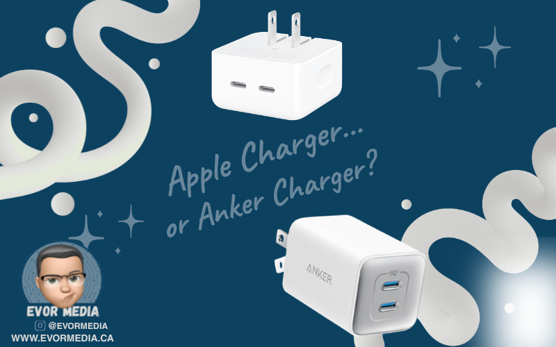
Best Phone Charger Brands: Apple vs Anker
After narrowing things down, there are really only two brands worth considering:
- Apple
- Anker
Both offer high-quality, safe, and reliable charging—but they approach it differently.
Apple Chargers: Reliable and Built to Last
If you want complete peace of mind, Apple is the safest choice.
Apple chargers are designed specifically for their devices, ensuring compatibility and long-term reliability. Their standard 20W USB-C charger delivers consistent performance and is ideal for everyday use.
That said, it’s not perfect:
- The design is bulky
- It takes up extra space on power bars
- It only offers a single port
But durability is where Apple stands out.
Many people still use older 5W Apple charging bricks today—even ones that shipped with early iPhones—and they still work. They may be slow by modern standards, but they remain dependable.
Anker Chargers: Best Value and Convenience
If Apple is the safe choice, Anker is the practical upgrade.
Anker has built a reputation for delivering high-performance chargers with better design and more features.
With Anker, you get:
- Compact chargers that don’t block other outlets
- Multi-port charging for multiple devices
- Faster charging speeds
- Better overall value
For most people, Anker offers the best balance between price, performance, and convenience.
Apple vs Anker: Which Charger Should You Buy?
It comes down to what you prioritize:
- Choose Apple if you want maximum reliability and zero risk
- Choose Anker if you want better design, more features, and strong value
Either option is far better than using a cheap, unverified charger.
Final Thoughts: Stop Treating Chargers Like an Afterthought
Your phone charger is something you use every day—often for hours at a time.
It powers your device overnight. It travels with you. It quietly supports everything you do.
The best charger isn’t the one you think about—it’s the one you never have to.
Stereo system from 1979
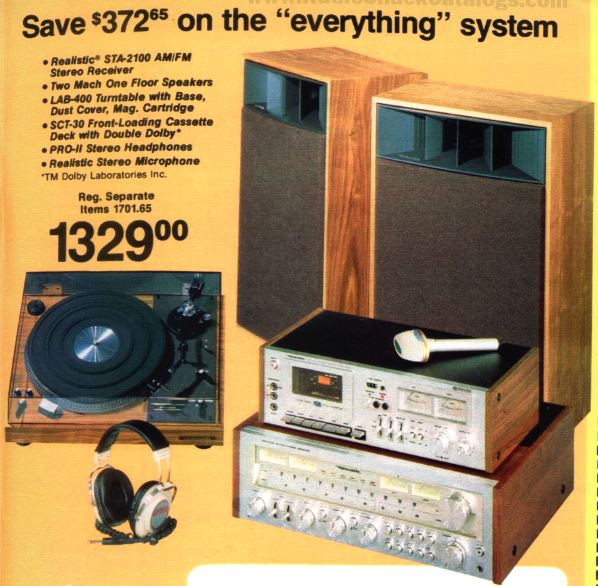
The system included Radio Shack house brand Realistic components:
- STA-2100 AM/FM Stereo Receiver
- Two Mach One Floor Speakers
- LAB-400 Turntable with base, dust cover, magnetic cartridge needle
- SCT-30 front-loading cassette deck with Double Dolby
- PRO-II stereo headphones
• ⁃ Stereo microphone
Back in 1979, Radio Shack had a pretty good stereo system that went for $1,329—which, if we were to adjust for inflation, would be about $5,700 in 2026. This system had a cassette tape player, which was still pretty new since that medium really started to take off in the mid-1980s. It was late 1970s tech, but to put it in perspective, for $5,700, it was just a music player.
I enjoy looking at how things have changed over the years, and it can be a fun way to see how far we’ve come. That stereo system, which would cost over $5,700 in 2026, is more than I’d pay for a 65-inch TV with a soundbar and subwoofer, which would totally outshine the 1979 system. Another comparison is that I can get an iPhone 17e for $900 CAD and a 200-watt Bluetooth party speaker from Amazon for $150 CAD, all for just over $1,000 CAD. On a side note, with that new iPhone, I’d get three months of free access to Apple Music, which means I could listen to pretty much every song ever recorded. So, yeah, life in the 1970s was pretty pricey.